How to Make a Sticky Bar
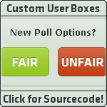
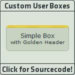
This tutorial applies only to this custom user box:

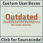
What this tutorial will do is stick your green/red bar to the top of your widget.

Example
NOTE: This will not work in the deviantID widget unless you have no deviantID selected.
Copy and paste the following code into the module you wish to apply the code to:
<div class="popup2-moremenu"><br><div class="floaty-boat"><img src="http://kitsunelunari.com/da/barspacer.png"/><br>PASTE YOUR BAR CODE HERE</div><div class="gr-box gr-genericbox">THIS IS WHERE YOUR CONTENT WILL GO</div></div></div>And we're done! Just modify the bolded code with your content.
How to Make Linkless Buttons
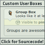
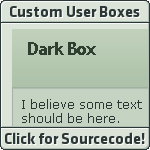
This tutorial applies only to these custom user boxes:
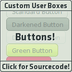
You know what a link (or hyperlink) is right? Well, these button have a place for hyperlinks. This tutorial removes them in case you don't have or don't want a link.
In each of those custom user box codes, you will find something that should look like this:
<a href="">Regular Button</a>Take out the
href="" part, and it should look like this:<a>Regular Button</a>And there we have it! These buttons will keep you stationary should you click one them.
 (Smile)")
How to Make No-Subtitle Boxes
This tutorial applies only to these custom user boxes:
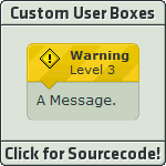
Those boxes have a placeholder for subtitles, but what if you have nothing to put? This tutorial will remove the subtitle placeholder if you don't have or don't want a subtitle.

Example
First, remove this from the code:
<br>SUBTITLE HEREAfter you remove that, locate the following in the code:
<div class="thumb-holder">And change it to the following:
<div class="thumb-holder cc-name">Now you only have a title, which is now larger to fit the empty space where the subtitle was.
How to Add Padding
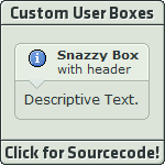
This tutorial applies only to these custom user boxes:
Do you want your boxes to have more breathing room? This tutorial will increase the space between your content and the edges of the box.
First locate the following in the code
<div class="pp">Do you see the part where is says
pp? This creates padding. You can only have one to four p's. Here's a basic list:p- Not very much padding.pp- Default padding. Medium.ppp- A large but good amount of padding in most cases.pppp- Maximum padding. High.
How to Customize User Box Icons
This tutorial applies only to these custom user boxes:
Note! I highly suggest you don't alter the icons of the Warning Box and Group Box because they will lose their authenticity.
 (Wink)")
This tutorial has actually already been done by CypherVisor!
")
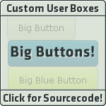
How to Make Any Button Disabled
This tutorial applies only to these custom user boxes:
There is a special regular button that is disabled. It's just slightly transparent. If you want to, for example, make your green button look disabled, find this in the code:
<i class="there will be stuff here">Green Button!</i>And add
disabledbuttonafter the other content in the class element:<i class="there will be stuff here disabledbutton">Green Button!</i>For the big buttons, put it in the
class element of the a tag, not the span tag. Like so:<a class="there will be stuff here disabledbutton"><span class="post">Big Purple Button!</span></a>